Wednesday, 28 January 2015

Adios Amigos

Hello everyone,

I made this card for for our friends who are moving to Seattle,WA. Goodbyes are always hard...
I have been pondering for days about what card should I give them and then I found this freebie of the map of United States from the Old Design Shop...and something just clicked...
I knew exactly what to make...


I took a black n white print of the map and glued it to a watercolour paper. Then I painted on it with some watered down blue acrylic colour (I chose the colour blue...coz it is always raining in Seattle).While this was drying, I took a printout of  the Space Needle, which is a landmark in Seattle. I fuzzycut the image and coloured it with Archival ink...It looked like a beautiful silhouette

I glued down the Space Needle on one side of the card and stamped the sentiment in Archival Ink.
I had to stamp on it a few times to get a good impression.

I drew the black border with a Bic Marker...


Now for the card base. I took a Kraft cardstock and stamp randomly on it with a few sentiment stamps.

Lastly, I placed the map piece on the Kraft base...
And the card was done...


I am entering this card in the following challenges:

Painted Map background - http://stampotiquedesignerschallenge.blogspot.in/2015/01/sdc180-painted-background.html

Space Needle silhouette - http://cceestampers.blogspot.in/2015/01/ccee1504-silhouette-card.html

Anything Goes - http://thepinkelephantchallenge.blogspot.in/2015/01/the-pink-elephant-challenge-tpe283.html

Blue Sky - http://www.simonsaysstampblog.com/mondaychallenge/?p=2385

Card Base Background using Sentiment Stamps -  http://lawnscaping.blogspot.in/2015/01/lawnscaping-challenge-create-background_19.html

Interactive & Iris Heart Card

Hello everyone,

When I was little, I received a birthday card from my cousin. It was an interactive. It had a small window and a circular tab on the side. When you slide the tab, the messages through the window would change...

Now many years later...I finally found out how to make one...Hurray!!!!!

So I chose to make a valentine card with this technique...
The quote says... For yesterday's memories,  today's happiness, tomorrow's dreams.... I LOVE YOU!!!
When you slide the circular tab on the left...the message changes...                              


For the front of the card, I have used pattern papers and some stamping on the side panels...


The I LOVE YOU is a printed sentiment...And the quote in message window is handwritten...


As this card is for my hubby, I wanted to make it more special (read complex :P )...
My husband loves interactive cards as well as elegant cards...so I did both...
I made a Iris fold heart as well...I just think it looks neat and elegant...
I used all my pink and red pattern paper scraps for the iris folding...


And to merge is all together I added the individual elements in an accordion card with 3 sides...


I am entering this card in the following challenges:
http://timeoutchallenges.blogspot.fi/2015/01/challenge-23-valentines-day-with.html

http://shoppingourstash.blogspot.in/2015/01/sos-186-love-me-do.html

http://wedodoobadoo.blogspot.co.uk/2015/01/challenge-2-romancewe-do-doobadoo.html

http://colourq.blogspot.in/2015/01/colourq-challenge-277.html

http://thepinkelephantchallenge.blogspot.in/2015/01/the-pink-elephant-challenge-tpe283.html

Inspired by the Colour Gradient (Class and Elegant) -  http://thecardconcept.blogspot.in/2015/01/challenge-27-love.html

Friday, 23 January 2015

Simple Henna Design Card


Hello crafters,

I am back with another card inspired by Marion's card on the Muse challenge....

I drew henna design on the card with white gel pen...
I just love henna design...its so beautiful...


Here is a closeup of the design

Sorry for the quality of pics...I was short of time and had to take these pics n the evening...so bad lighting...

Also I had the hardest time capturing the actual colour of the card in the pics...
The card is actually a very beautiful violet...

Here are some other pics of the card...


I am entering this card in the following challenge:
http://musecardclub.blogspot.in/2015/01/muse-challenge-101.html

Thursday, 22 January 2015

Simple Tribal card

Hello crafters,

Its fun to mix up things...so I mixed up the 2 things I love...doodling and CAS...
I was inspired by Marion's card at the MUSE challenge this week
I have kept the card shape and layout same as Marion's.
But I have changed up the colour and design...
Instead of Marion's floral design, I went for a more tribal design with lot of triangles...which is the twist at Artistic Inspirations


I did the doodling with white gel pen and white Sakura marker...
I like how white doodles look on the dark cardstock...


Here is another look at the card...


I think I am gonna make more of these...with different colours and designs...


Braided card - II

Hello everyone,

Here is the second braided card I made...
The braid is the same...only the layout and background colour for the braid are different...

The braid is basically a set on intertwined triangles...
You can see how I made the braid here...


I stamped the border of the card with a feather stamp with Tumbled Glass and Olive Green DI.
I really liked how it turned out.


I stamped the sentiment in blue dye ink and then overlapped with Olive Green DI. The second time I stamped slightly off...It gives such a nice effect. I also stamped a little feather with the blue and Olive Green inks.


In this card, I placed d braid on the right upper corner...
I placed a green coloured cardstock on the back of the braid to bind it with the colours on the card...

Wednesday, 21 January 2015

Take-away Menu Holder

Hello everyone,

I love upcycling projects. Its so great to see how you can convert something you already have into something else...

I made this Menu holder from a Cereals box...


I also added a divider in between to seperated the favourites from the others...


This was totally made from scraps...
I had some scrapd of vintage papers lying around...I added stripes of the papers to cover the box on all sides...

I am entering this holder in the following challenges:
http://lessology.blogspot.in/2015/01/lessology-challenge-43-cardboard-central.html
http://dreamvalleychallenges.blogspot.in/2015/01/challenge-98-anything-goes.html

Braided Card - I

Hello everyone,

There are so many different things you can do with papercutting...its just amazing...
I saw a braided card on Pinterest once and I just had to try it...

There are many templates available online...
But I made my own template as I didn't have any at hand....
I started out by marking the lines with a pencil...
I drew the stencil on the inside of the card...and cut the lines with an exacto knife


It looks so pretty once the braiding is done...
I added a panel of coloured cardstock on the inside of the card to bring out the beauty of the braid...
And added a stamped sentiment...


Here another look at the card:

I am entering the card in the following challenges:
http://casethissketch.blogspot.in/2015/01/case-this-sketch-106.html

Tuesday, 20 January 2015

Blog/Art Planner

Hello crafters,

Its hard to keep up with all the challenges...their themes...end dates...and then to keep track of the ideas that just pop-in...the pending DIY project...
So I decided to make a Blog and Art planner for myself...
I wanted the inside to be pretty simple...but I wanted to try out something new on the cover...
And this is the first time I clicked photos while making the cover...

I read a good quote about Art somewhere...it was pretty long...but I liked the ending...it said "Splash a little paint...draw a little line...have fun"...


I started out with the cover of a cereals pack...its cardboard...so its pretty sturdy...
I cut it to measurements and punched two holes for binding with a ribbon


I did the same with the pages...


Well...as I said its the first time I tried to take in-progress pics...I missed out on the first one :D...
I am always so eager to move to the next step...that I forget to take pics...

Anyways....I applied a mixture of fevicol(glue) and water on the cardboard and then pasted a newspaper clipping on it (you can see it through the paint here). Next I applied a coat of acrylic colour which I thinned down with water to get the translucency...


Then started the zentangle and doodle madness...I covered the front of the cover with doodles and patterns


To match with the quote I added splashes of paint...
I also cut out some leaves from scraps of pattern paper and glued them...


Now...time I pasted the quote...I teared it roughly and distressed the edges with Vintage photo...


To finish it off...I went over the whole cover with a mix of fevicol, water and a bit of blue paint (as I wanted to mute the colours of the quote and leaf a bit)


I would like to mention that I was inspired to try out this new technique after I saw a tutorial on My Art Journal. I love Diane's work. You should check it out. She makes such beautiful pieces of art. Its awesome!!!

I would like to add this planner cover in the following challenges:
http://lessology.blogspot.in/2015/01/lessology-challenge-43-cardboard-central.html
http://anythingbutacard.blogspot.in/2015/01/have-you-begun.html
http://alphabetchallengeblog.blogspot.in/2015/01/x-for-x-periment.html


Saturday, 17 January 2015

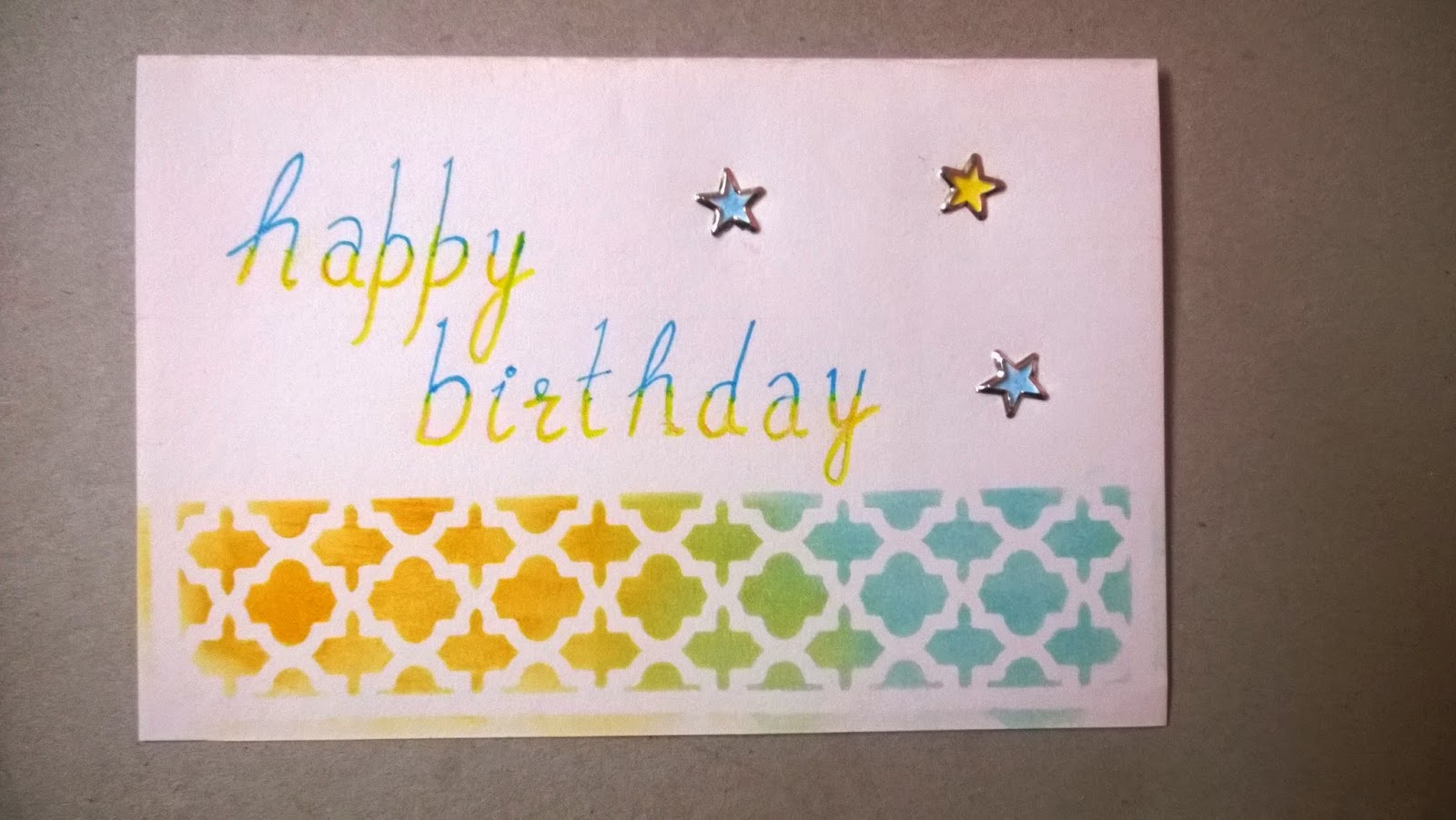
Yellow & Blue

Hello everyone,

What I like about participating in challenges is that they push me to try out new things...new themes...new colours...
Like the colour combo which I used in this card...coz...otherwise I would never use blue and yellow together...


And let me tell you I am just loving this combination...its so fresh...

So I used my only pattern stencil (in pursuit for a new one :P ) with Wild Honey and Tumbled Glass DI. Wrote the sentiment wit markers. I coloured the stars with colour pencils and then applied the silver stars.

Another look at the card...

I am entering the card in the following challenges:
http://stampinroyalty.blogspot.in/2015/01/stampin-royalty-challenge-262.html
http://casethissketch.blogspot.in/2015/01/case-this-sketch-106.html

Thursday, 15 January 2015

Football Shaker/Camera Popup card

Hello everyone,

I just love making interactive and popup cards. So, when I had to make a birthday card for my brother-in-law, I thought of doing both...
I made a shaker + popup card...shaker on the outside....popup on the inside.. :D

There is another combo in this card...My brother-in-law loves football. His favourite club is Chelsea. He is also an avid photographer. So I incorporated both his interests in this card.

I found this layout on Pinterest ( Toni's Adventures )


For the shaker, I printed out small footballs, chelsea logos and cameras and fussy cut them.
I didn't add any glitter or sequins as it would have contradicted with the football theme.


For the inside of the card I made a camera popup...Ohhh...I just love making popups...They are so fun...
I got the template of the camera from ExtremeCards


Here is a final look at the card:


The camera is a vintage one, so I distressed the edges with Vintage Photo for the inside of the card 
To finish off the card, I added a birthday quirky note.
Also I crumpled the blue and green papers a bit on the card front to give it a more rugged look...


I am entering this card in the following challenges:

Sunday, 11 January 2015

Thank You card

Hello everyone,

I am back with another CAS card...

I always try to learn new techniques...but some techniques need new supplies...and sometimes you just cant invest in something...
And then there are frugal ways to recreate the technique...
So I set off to try making and using the homemade version of modelling paste(I love experimenting)...
I found many recipes with the following ingredients:
Acrylic paint
Baby Powder
Glue


I used my rose stencil and used a business card to swipe it through my stencil...It looked beautiful...

But after it dried...it looked translucent...I think it was because my quantity of powder was more....I will add more paint next time...
But the translucency gave it a very beautiful effect as the background stencil and colours were visible through the rose...


 Now, for the background I used a Hampton Art stencil and some distress inks...
I think this is the first time I have used 2 stencils on a single card :)
I also added a stitched border to it. I used some pink embroidery thread for the stitching....
The sentiment is handwritten with a white gel pen.


The card depicts the view through the grills of my window of the lovely shrubs of roses in the garden!


I am entering this card in the following challenges:


            Share Our Badge on Your Blog!


Virginia's View Challenge  UnstampaBelles ChallengesArtistic Inspirations


Take this badge for you blog if you love to play Quirky!

( You can click on the images to go the respective challenge pages)


Related Posts Plugin for WordPress, Blogger...